How to design a corporate brochure?

A brochure is a common and most essential business material that is needed by every business to advertise its brand, products.
Brochure acts as a communication tool for businesses and it says about the business to the targeted people that you want to attract to your business.
The functionality of a business brochure is so high that every business is using these important branding materials as a necessary item.
Whatever type of business you have, you need to own brochures with a decent design that focuses on your brand personality and also able to foster your brand loyalty.
If you are a successful business owner and you are thinking of getting connected with more people. Then the brochure is something that will keep you up with your wish.
But to have a great brochure for your business, you have to determine the purpose and the type of your business. Then you have to think about the design that will work best to focus your business.
Brochure design is now as popular as every business owner thinks to have great brochures on their desk with the brand identity.
If you are one of them and come here to get some information about designing an attractive brochure for your purpose, then you are in the right place at present.
Because we are also describing the same to make you clear over this topic,
Table of Contents
Necessary options to design a perfect brochure
Brochure design is the task of much experiment and understanding that is done by a graphic design company.
You have decided to advertise your brand or its product and services, the next thing you need to do is to find any of them.
Finding a graphic design agency to make an advertising brochure is not a hard task nowadays.
As there are so many graphic design service agencies now available both online and offline. If you already find one graphic design agency, then you should discuss them about the design and quality of your brochure.
In the discussion period, you need to realize some issues that must include your brochures. What are these issues? Let us show these to give a better concept,
Focus your brand personality
You are making a brochure to increase your brand visibility among the common peoples. Isn’t that?
Then your brochure should be designed in a way that can talk to people even if it is just a printed form.
Generally, when you go to a design agency or print media agency to ensure the best design for your organization. They also ask you, what your brand is related to.
Your brand identity should take as the main priority while designing a brochure for you.
Pick a distinct brochure-type for you
There are so many brochure types that you may offer by the agency whom you give the job to design your business brochure.
Each type comes with different sizes, shapes, and looks. If you are already familiar with the brochure types, then good. If you aren’t, here we are including all these effective brochure types that will help you to choose one of them,
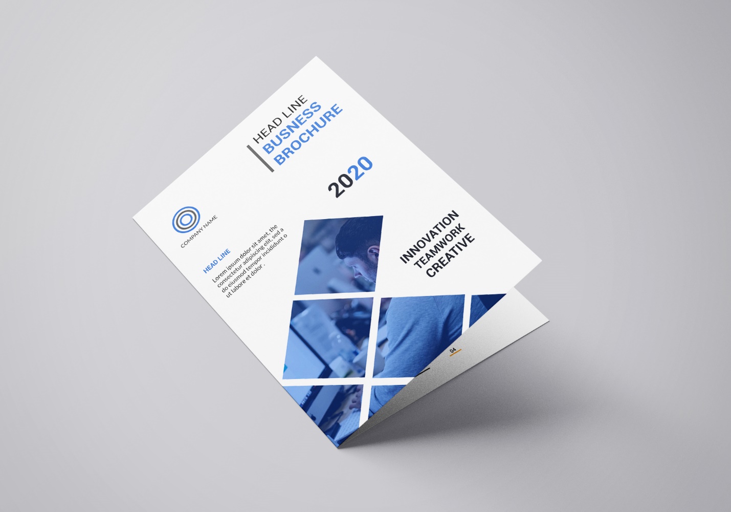
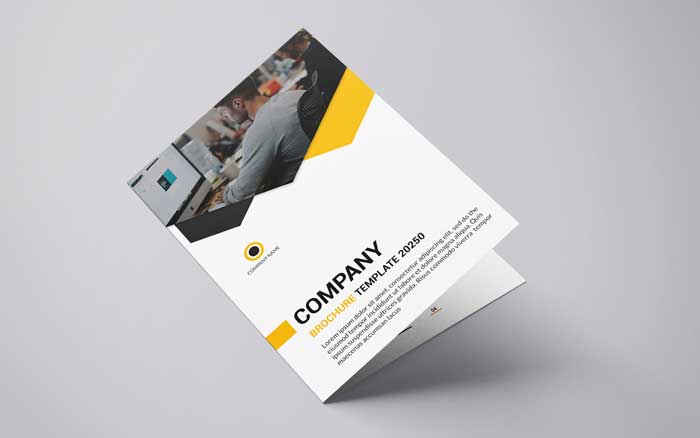
Half-fold
A half-fold brochure is the most common type of brochure as you can see it everywhere. This type of brochure comes with 2 folds that include four panels.
This type of brochure also known as the bi-fold brochure as the paper that is used to make this brochure has been folded for once.
This type of brochure design is perfect for product presentations, programs, pricing sheets, city maps, real estate offerings, and some other purposes.
If you think to design a half fold brochure for your company, then you should pick the size of 8.5” *11”.
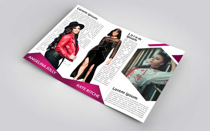
Tri-fold
This is the most used and versatile brochure form that you can use for your brand. If you are thinking of designing a brochure but you need more space to express your brand identity while saving some costs.
This brochure design can take you up with your needs. This type of brochure is also known as a letter fold brochure. Tri-fold brochures come with 6 panels as it divides a single paper into three equal halves.
The best size for tri-fold brochures is also 8.5” *11”. But you can design it in other sizes like 8.5” *14”, 11” *17”, and 11” *25.5”.
This type of brochure is best to use in every type of business and product marketing
Gatefold
Gatefold brochures come as costly and as it uses premium paper to print. The folding type of this brochure is inward folding which gives it a royal look. You can carry this brochure anywhere you want.
Gatefold brochures are also known as window fold because the side panels of this brochure measure almost half of the central panel.
Gatefold brochure has two different forms according to the folding system it includes. They are,
Open gatefold
Like a double door, this type of brochure comes with one larger panel that remains obscured by two shorter panels.
Closed gatefold
Closed gate fold brochures tucked with two panels with a half fold inside. Because of its shape, this brochure opens like a half fold brochure. For the larger types of presentations, this is a good choice to pick up for your brochure design.
Choose color and fonts carefully
Colors and fonts are two strong objects in most printed media. Colors are the best way to catch people’s attention.
Different colors have different meanings and feelings. Proper use of color can talk to potential customers that you are professional enough with what you are doing.
So, the color you are choosing for your brochure should have a direct connection with your brand and its personality.
If you are having a hard time choosing an exact color form for your brochure, you can simply use your logo color palette to define your brand taste.
Most of the organizations do this while making printing material for their organization like business cards, brochures, flyers, and others.
You can also do this to create your one.
You also have to pay attention to the fonts that you are using in your brochure. As with other print accessories, don’t use more than 2 separate fonts in your design.
One for the headline that shows your brand name and another font for the body of the insides letter. You can choose three if you want to add some other information like your address, contact information in a different font like italic.
Be classy to your headline font as people will look into that first while they have your brochure in their hand.
First impression
Words people are saying, you may hear this, the first impression is the last. Publishing brochures to increase your brand identity is almost a good way.
The way is using since from the past days and you can say that brochure is now a strong branding and marketing material without a single doubt.
But you can’t say with much surety that people will just have to read your brochure. That is not possible. People are now too busy with their regular work and they don’t have enough time to read a brochure of different organizations.
Well, you can ask then why you need to design a brochure when people don’t even read that. That is a complex issue to discuss but it is a probability.
Not all people are the same if you distribute your brochure to a hundred people, then at least 20 of them will give attention to that.
For that 20 viewers, you have to present your brochure with a first impression that can take them into the inside of the brochure.
Include perfect imagery
Brochures aren’t an addition of a novel nor a short story. It is a marketing material that should have the ability of why it would create.
Your brochures not only hold important information about your business but also include imagery like your business products, items, and services category.
Including the product and services category doesn’t mean that you would present it as a product catalog.
The product catalog and brochure are two different things. Brochures express a brand identity along with the brand history, the type of working, how the company deals with the customers, and how they dominate as the best in their sector.
Brochures also come with a company’s vision and mission to lure their targeted audiences to get connected with them.
So, it is important to include perfect images into your brochure to have a great result with that.
You can use some real images like your organization’s global achievements, customer responsibilities that can show others your professionalism with the brochure.
Your targeted audience
Not all people can respond to your brochure. What type of business are you leading? Who needs your service? Whom should you provide your help?
Before starting to design a brochure for your business, you should ask these questions yourself.
If you do this, it will be clear to you in which way you should design the brochure. Different people have different tastes.
If yours is a tech-related company, then you have to give priority to those who loved tech accessories and fond of tech services.
Then your brochure should be presented in such a way that it can easily attract the common people who have a few interests in tech related things.
What type of business you are and who are your actual customers? You should have considered their taste and should have presented your brochure in that way.
If you follow all those steps of brochure design to create a perfect one for yours, then you would surely get the best brochure you need.


